Take A Number: User Experience, Take 2
Published:
After publishing Take A Number: User Experience, I received a critique from Vick Lane who is an experienced UX professional in Australia at Square V Design.
Let’s take her critique piece-by-piece and see how we can improve the user experience.
UX is not just making wireframes
Vicki is very restrained when she says:
In my opinion, engineers are actually really well placed to do UX things, because it requires seeing people as a part of a system and thinking systematically about their behaviour. But it does require some perspective taking, and I think maybe here you have thought about the system a lot and the users maybe not enough (this is why UX is more than just making wireframes).
Error in the Servicer UI
Vicki notices one problem straight away:
I can see one egregious error with your Servicer UI, which is that your servicer needs to know who they are currently servicing, not who is next in the queue…. I can almost guarantee that someone using this is going to hit the button to say “I’m done with that person” and then call out the number at the top of the screen — which in this case would be the person 2nd in the queue, not the next person in the queue (not the number they need to call out next).
And later suggests a way to fix it:
Wireframes are just the screen layout, and going straight to wireframes often results in this kind of error. If you want to think about how something will be used, I think drawing a flow diagram of the steps the person needs to take is a lot more useful!
After looking at this for a while, I think my problem is that I made the sequence diagrams a little too detailed. And that gets to the heart of the critique:
You have thought about the system a lot and the users maybe not enough.
So let’s rethink the sequence of how this will work.
A “higher level” sequence diagram
The sequence diagram below aims to focus more on the human actors than the system, and see when they will interact with the system and what information they may find useful from the system.
The entire Take A Number system is now encapsulated into one object called TakeANumbeSite.
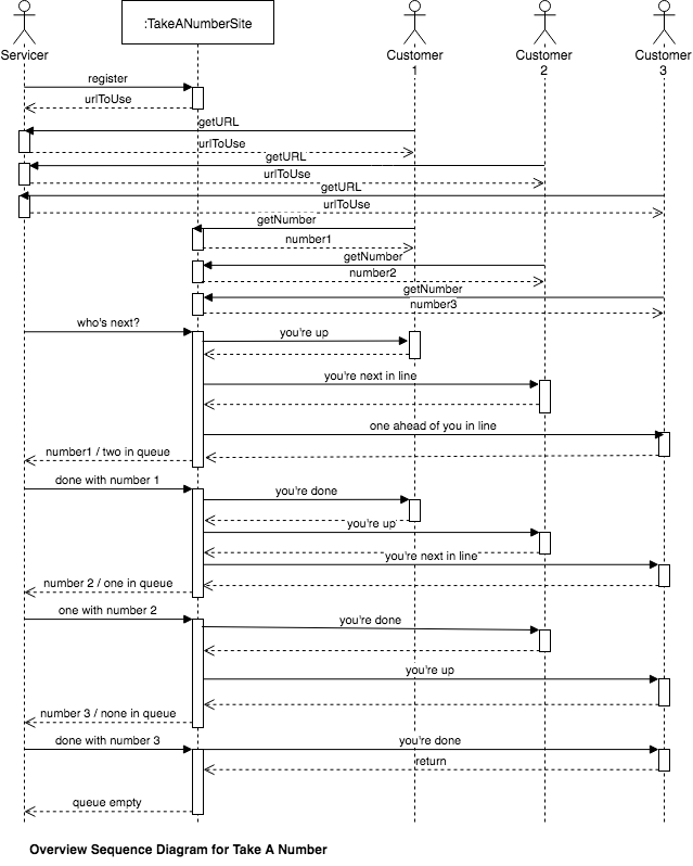 A higher level sequence diagram.
Error in missing requirement
Vicki also pointed out a specific problem with how the Service will work with this system:
Your Servicer doesn’t really need to know what the 2nd person in the queue is, they need to know the length of the queue so they they can call in additional help if there are too many people — this is actually one of your requirements! It’s not covered in your UI at all.
Your flow diagram of this for the Servicer might have looked like:
_Serve customer -> Call out next number -> Serve Customer
with some sort of offshoot for “if there are too many customers, call for backup”_
As Vicki says, the original wireframe below had the important information (who is the servicer helping now?) in smaller font, and completely failed to show the queue length.
 Original wireframe.
Other Issues: Sharing URL to Customers
Another issue that the overview sequence diagram above picks up is: how does the Servicer let the Customer know how to get a number? That’s going to be part of the registration process, and the URL should be simple to share.
The WayApp.Cards app generates QR codes that can be scanned to generate a new number. I’m going to ignore that solution for now, and just try to make the URL that the system generates as human-readable as possible. Something like:
https://tan.kootsoop.com/«queue name / ID»
Here, the queue name / ID should be as few lowercase alphanumeric characters as possible. For example CET236 might be good for my Saturday classes.
Other Issues: Letting All Customers Know What’s Happening
The overview sequence diagram also shows that it would be nice for all Customers to know where they are in the queue.
Other Issues: Customer Needs More Help
Not shown in the overview sequence diagram is what happens when a Customer who previously sought help needs help again. They should either use the same original URL given to them by the Servicer, or there should be some way for them to ask again after being told “you’re done”.
Other Issues: Servicer Empties Queue, A New Customer Arrives
Also not shown in the overview sequence diagram is what happens mid-class, when the queue has been emptied and a new Customer appears. A “notification” style mechanism might be good here.
Wire Frame Updates
So, given the criticisms, let’s redo the wireframes.
Customer Wireframe
After taking into account the discussion above, the updated wireframe for the customer looks like this.
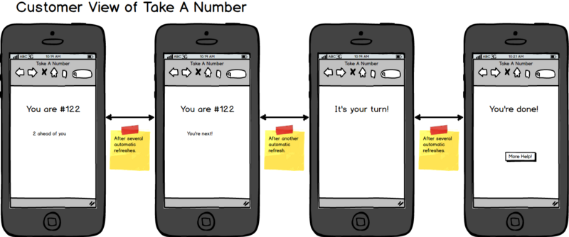 Updated Customer wireframe.
One thing that this suggests to me is: what happens if customer #122 decides they no longer need help? Perhaps a cancel button could be added to the first two screens? I’ll leave that out as “scope creep” for now.
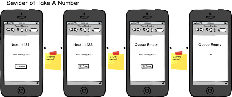
Servicer Wireframe
The updated Servicer wireframe then looks like this.
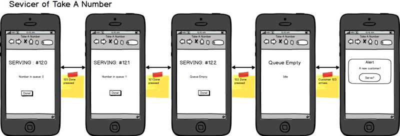 Updated Servicer wireframe.
The main changes are to remove the “next” number and only show the “now serving” number and to add the queue length to the display. Also added, though I’m not sure it’s quite right, is the alert box for when a new Customer needs help after the queue is empty.
What Next?
Next I’m going to start making some software architecture and technology decisions on how this will be implemented.