
COVID-19
Published:
COVID-19 : Using Excel to forecast
I’m interested in data analysis. I used to call it statistical signal processing, but these days it’s more like big data or analytics (though there are differences between the three).
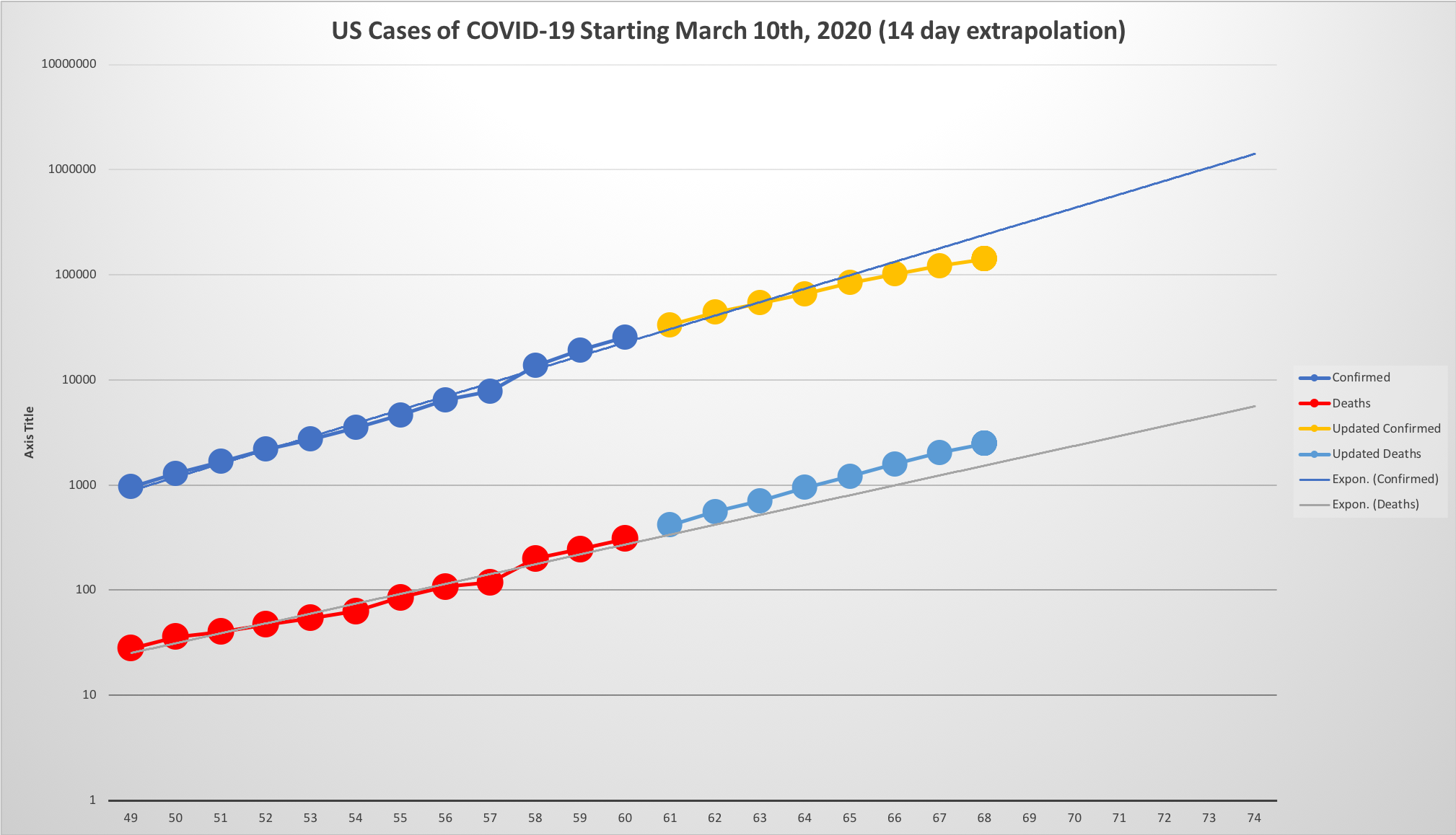
Everyone was saying that we needed to bend the curve or flatten the curve as far as the incidence of COVID-19 infections is concerned… but no one was showing this as clearly as I wanted.
Data
The first step was: where do I get the data? Thankfully, Johns Hopkins University (JHU) is collating the data and making it publicly available on GitHub. The time series data there is in three separate files: confirmed cases, deaths, and recovered cases.
Excel
Because the data from JHU is in three separate comma-separated value (CSV) files, I created a new Excel spreadsheet, opened each CSV file in Excel and moved them into my new sheet. This created the confirmed, recovered, and deaths tabs.
I made a new sheet called plots to put my collated data and the plots themselves.

Plots tab
Because I prefer to see the data that is being plotted on the same sheet as the plots, I created several data lines at the top of the sheet:
- the date,
- the confirmed (2020-01-22 to 2020-03-21),
- the recovered (2020-01-22 to 2020-03-21),
- the deaths (2020-01-22 to 2020-03-21),
- the confirmed data (from 2020-03-22 onwards).
Then, I plotted five things versus the date: the confirmed, recovered, and death numbers (up until 2020-03-21), a trendline on the confirmed numbers up until 2020-03-21m, and then the confirmed numbers after and including 2020-03-22.
To get the US-only data, the confirmed, recovered, and deaths tabs all have filtering turned on and the Country/Region column is filtered on US. The data fields on the plots tab are then summations on the same column on the individual tabs. This means, by filtering on different countries, the same plots for other countries can easily be generated.
Exponential trend line
There’s a problem in Excel that means you can’t plot an exponential trendline if the x axis is a date. So I had to add another $x$-axis number, which was just an integer index of the date since the start of the data on 2020-01-22 (using 1-based indexing).
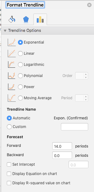
The settings I used for the exponential trend line are in the picture above. Because the virus has a 14-day incubation period, I chose a look-ahead of 14 days.
Are we bent yet?
The question I was trying to answer when I started this is: Are we bent yet? #arewebentyet
Based on yesterday’s (2020-03-29) data, looking at the plot at the top of this post, the answer seems to be:
YES!
Data
The spreadsheet for that plot is here.